


At the recent Information Builders Symposium for Canada’s Public Sector event (#IBAnalyticsSymposium), one key message was reinforced by presenters over and over – successful adoption of data analytics depends as much on soft skills as it does hard data. While it’s true that you need a good data foundation for any analytics initiative, you also need buy-in, stakeholder engagement, and transparency for the initiative to flourish.
For the past six years, Information Builders, makers of a scalable software solutions for data management and analytics, has gathered data analytics experts from the Canadian Public Sector to share best practices and practical tips. Attendees represent police forces, fire departments, public health authorities, municipal governments and healthcare providers.
This year’s event was held at the same venue where the first ever Symposium was held– Niagara-on-the-Lake. Located 80 mile southeast of Toronto, this region is best known for its local wineries and as such, provided the perfect analogy for the event.
The attendees that I spoke to who attended that first Symposium informed me that much of the discussion was centered on the mechanics of data analytics: how to gather data, normalize it, store it securely and build reports/dashboards to leverage it. As the years passed, the Canadian public sector matured in their use of advanced data analytics platform and the sessions at Symposium shifted to be much more strategic.
Like the wines aging in barrels surrounding the venue, the Symposium has become more refined, transforming from simple beginnings into something more elevated, nuanced and sophisticated.
The dozens of speakers at the Symposium had one key message for attendees – to be successful with data analytics you needed more than mastery of your data, you needed mastery of soft skills as well. In particular, the speakers highlighted the need for leaders of data analytics initiatives to:
- Gain buy-in from executive leadership
- Involve stakeholders in the design of data visualizations
- Communicate regularly on the project status and share examples where data was used to improve decision-making
- Be transparent on how the organization’s data is being gathered, stored and used
- Align their work with the organization’s overall strategic objectives
Huron Perth Health Alliance
Huron Perth Health Alliance (HPHA) started their data analytics journey by creating a simple dashboard that displayed, in real-time, the location of every patient. It was built with input from front-line users who were eager to be rid of the paper clipboard which they were using to track their patients. The HPHA continued to consult with end-users as they rolled out additional dashboards.
“We tried to make things easy for users,” explained Iris Michaels, Director of Decision Support & Financial Planning. “We held coffee breaks when going live and had demos. For those leaders that were not logging in the system, we spent time with one on one engagement. This was to ensure comfort and that they understood the data/tools were developed to help the with their daily operations. Sure enough, as soon as they saw the value, they became frequent users.”
“Knowing we are able to make both in the moment and longer term decisions on a foundation of real time data is fundamental to our organization in meeting the health needs of the community we serve,” said Andrew Williams, President and CEO of the Huron Perth Healthcare Alliance in a written statement to Healthcare IT Today. “As a leader immersed in system change, confidence in the data and the subsequent information it generates also allows me to engage proactively with our Partners around the important system decisions we need to make moving forward.”
Queensway Carleton Hospital
Queensway Carleton Hospital (QCH), a long-time user of Information Builders, shared how they started with simple financial dashboards and used them to gain the trust of users before expanding their analytics initiative further. By working closely with hospital executives, the QCH team now has evolved their implementation to include sophisticated benchmarking capability. This allows them to compare their performance on key financial metrics with peer organizations and makes it easier to identify where operational improvements can be made.
The QCH team, under the leadership of Dr. Laure Pitfield (Director & Privacy Officer), has earned so much trust from the senior executives that they no longer use powerpoints to review financial performance. Instead, QCH uses the enhanced dashboards created by her team that allows for users to enter their comments within the visualization itself. This has reduced the time required to prepare for the quarterly meetings, made financial reporting consistent across the organization and contributed to better decision-making at the hospital.
This same automated approach is now a key component of QCH’s new Surgery and Perioperative Data Analytics Program.
Conestoga College
Clean drinking water for communities that are dependent on wells is vital for the health and well-being of the population.
A group of students from the Applied Health Information Science program at Conestoga College (an Information Builders partner) presented their winning data analytics project to help communities determine if private water wells were safe.
Using publicly available data on well-water testing, the students built a dashboard that showed the quality of a region’s drinking water:
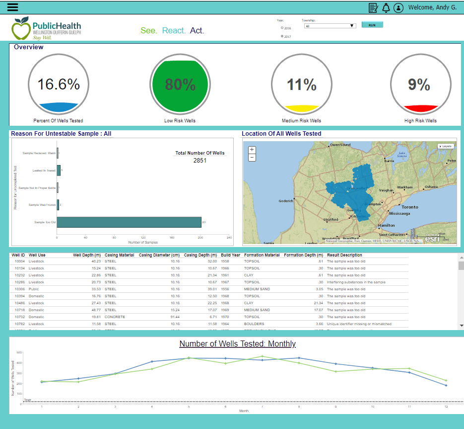
Their dashboard makes it easy for public health and public works officials to see which wells have not been tested in a long time and which have tested positive for contamination.
In their presentation the students spoke about how they iterated the way they displayed the information in the top banner of their dashboard. In early versions, they simply showed a number for each of the data elements – like 245 low-risk wells vs 25 medium risk wells. Although functional, users had no way to know if 245 low-risk wells was good or bad.
Based on feedback from end-users, the students changed the display to a % to provide more context and meaning.
York Region Police
York Region Police (YRP) uses advanced data analytics combined with GIS-technology to deter crime and safeguard the lives as well as property of the 1.13 million residents that live/work in the community they serve. Using data from multiple sources, YRP provides its officers with real-time information on where patrols have not occurred recently (one of the best crime deterrents is the presence of police vehicles patrolling an area) and where there has been recent criminal activity reported.
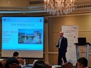 Greg Stanisci, Manager of Business Intelligence and Data Analytics at YRP, shared an important lesson from their journey – the need to be transparent on how data is being used. As you can imagine, there is a lot of information held in police reports including the race, gender and socioeconomic profile of victims as well as suspects. This information is very sensitive and if used improperly, could result in actual or perceived bias (or both).
Stanisci spoke at length about the early challenges convincing leaders to believe in the vision of becoming a data-driven organization (think Moneyball but in a policing context). A key to his success was the high degree of transparency that was used throughout the implementation. Leaders knew exactly what information was being used to generate the visualizations and almost as important, what information was NOT being used.
This transparency helped Stanisci gain the trust of senior leaders.
Symposium – A pleasant surprise
Involving stakeholders, building trust and being transparent were reiterated by all the other speakers at Symposium. In fact, the only sessions where the data itself was discussed in detail was during a cybersecurity presentation and when Information Builders presented their product roadmap.
This focus on strategic issues vs technology challenges was a pleasant surprise. I went into the event thinking it was going be two days of heavy-duty statistical analysis and data normalization discussions. Thankfully it was totally unlike my preconceived notion. In fact, it was much like discovering a new wine – an unexpected surprise and delight.


